Scott Mericle
Welcome to my corner of the web.
About Me
To be honest, I'm a pretty simple guy. I enjoy solving puzzles and challenging myself to learn new things. I found the UX career field to be perfect for me, as there is always something to improve!
I've been in the UX field for 9+ years now, and in that time I've had the opportunity to wear ALL the hats:
- UX Designer
- UX Researcher
- UX Engineer
- UX Strategist
- UX Mentor
- UX Lead
Sure, some hats are more fun to wear than others, but I can personally admit that having the opportunity to grow in each speciality gave me a much better perspective of the industry.
If you are here to review my portfolio, ignore eveything I've said so far and read my professional introduction below:
UX Strategist and Researcher with nearly a decade of experience aligning user needs with business goals. Specializing in enterprise B2B and government UX, I turn research into actionable insights that drive product success. Passionate about solving complex UX challenges, collaborating cross-functionally, and making data-driven decisions to enhance user experience and business outcomes. Seeking a role that blends UX strategy and business thinking to create innovative, user-centric solutions.
So, now that we got the formal portion of this out of the way, feel free to check out some of my work or ideas!
Strategy
Summary: Over 8 years at Accruent, I led UX strategy and execution for 10+ enterprise SaaS products across diverse industries. I owned the full UX lifecycle, translating complex needs into clear, intuitive experiences that aligned with business goals and user needs.
UX Strategy Across 10+ Enterprise Products
Over the course of 8 years at Accruent, I led UX strategy and execution across more than 10 enterprise software products, each in a distinct industry with unique user roles, business goals, and technical ecosystems.
My core mission was to improve usability while aligning design decisions with user needs, business objectives, and technical constraints. I worked as the lead designer on nearly all of my projects, often owning the full UX lifecycle from discovery through delivery.
Despite the domain differences, from construction project management to lease accounting and energy optimization, I noticed common patterns: users want to accomplish tasks efficiently, avoid cognitive overload, and feel confident in the tools they use. My job was to help make that happen, one product at a time.
My Role
As a UX Designer, I was the primary UX owner on the projects I worked on. I partnered closely with cross-functional teams including:

Product Leadership

Developers / QA

Data Engineers

Software Architects

Customer Support
While I occasionally assisted other designers, most of the time I led design efforts independently. I owned everything from research and problem framing to wireframes, high-fidelity mockups, prototypes, and documentation. I was responsible for all design decisions and deliverables in my domain.
How I do UX
Kicking Off a New Product or Project
When I was assigned to a new product, I embedded myself with the team—attending standups, sprint reviews, grooming sessions, and any opportunity to gain context. For new projects, the need usually emerged through customer feedback, usability concerns in support tickets, or product strategy shifts. From there, I would lead discovery to clearly define the problem and user needs before diving into design.
Research and Discovery
Research is the foundation of good UX. To better understand some of the systems, personas, and problem spaces, I would rely on these (but not limited to), research methods:
- User interviews with power users and new customers
- Usability testing on existing workflows or early concepts
- Heuristic evaluations to identify UX friction
- Analytics and customer support case reviews to identify problem hotspots
- Surveys and questionnaires to capture broader sentiment
- Stakeholder interviews to understand business and tech constraints
- Task and journey mapping to uncover user goals and pain points
Tools and Collaboration
I rely on a variety of tools to communicate insights with stakeholders and my peer, as well as collaborate with cross-functional teams.
- InVision Freehand, Miro, and FigJam for workshops and whiteboarding
- Confluence for documentation and research logs
- Jira for managing tasks and tracking progress
- Microsoft Teams & Office for meetings, communication, and stakeholder presentations
Everything I created was made with transparency and alignment in mind. Whether it was a user journey map or a high-fidelity prototype, I made sure everyone—from engineers to executives—could understand the rationale behind it.
Framework and Strategy
Obviously I have to mention my methods for strategy! What kind of strategist do I look like?!
- Jobs to Be Done and Design Thinking for problem framing
- Task flow analysis and service blueprinting to simplify complexity
- Accessibility heuristic and SUS scores to ensure usability
- RICE and MoSCoW to help prioritize design decisions and features
- Can't forget OKRs to connect my work to improving the value of the business
Reflection
The biggest surprise in working across so many industries was how universal user needs really are. Whether someone is managing telecom assets or planning a lease agreement, their goals are often the same: get in, do what they need, and move on, confident that they did it correctly.
What made me successful in this environment was simple: I refused to fail. I entered the UX world with no formal background in design. I was given a shot, and I decided to earn my place. I worked harder, learned faster, and grew into a top-performing designer who could navigate complexity, ambiguity, and domain shifts with confidence.
What did I get out of this?
Well, I am glad you asked! Thanks to the experience that I gather during my time with Accruent, I was able to improve my systems thinking abilities by understanding how each part connect within a larger complex environment.
The biggest lesson I learned when working in an enterprise, B2B SaaS company was to translate the complexities into clear and understandable actions. Our customers jobs are hard enough, so our software needs to be the tool that helps them accomplish what is important to them.
Ultimately, my efforts were successful simply because of my ability to quickly frame the problem, by asking the right questions, and understanding what people really want when they log into the product.
Research
Summary: The VA had over 300 APIs, but developers struggled to find the right one due to poor documentation and lack of clarity. A simple maturity model was created to show which APIs had good support, documentation, and test data, making it easier for developers to choose and trust the right API.
Designing a Maturity Model for Clarity and Trust
With over 300 APIs in its ecosystem, the U.S. Department of Veterans Affairs (VA) offers an incredible depth of data and services, from healthcare records to benefit claims, education assistance, and mortgage guaranty.
But for developers trying to integrate with these APIs, whether internal VA engineers, external agencies, or third-party vendors, the experience was overwhelming. The sheer volume of APIs, inconsistent documentation, and lack of reliability indicators made it hard to pick the right one.
So I designed a UX-driven API Maturity Model, a simple and transparent way to help developers evaluate APIs without discouraging API providers or imposing judgment. The result was a meaningful step forward in developer trust, usability, and decision-making.
What was the problem?
While APIs are intended to streamline development, sometimes the developer searching through the library would find it difficult to identify which one is best for their work. Developers found themselves sifting through multiple APIs offering overlapping datasets, with little guidance on which one to use. In some cases, two APIs might return similar results, but differ just enough to raise doubts about reliability or accuracy. There was no central framework to help developers make informed decisions.
Adding to the challenge, documentation quality varied widely. Some APIs had well-structured guides and examples, while others offered little more than an endpoint and a guess. It was not uncommon for teams to spend days untangling vague documentation, only to find that an API wasn’t actively maintained or lacked a functioning test environment.
What made matters worse was the absence of any visible signals for quality or support. Developers had no insight into how often an API was updated, whether it was stable, or if help would be available when issues arose. The result was a frustrating landscape where even seasoned engineers hesitated, unsure whether the API they selected would meet their expectations.
And while it was clear that better guidance was needed, we also had to tread carefully. The goal was not to penalize or shame providers it was to build trust and clarity without judgment.
The Solution
I was responsible for taking this high-level concept into a tested, customer validated, actionable framework that could bring clarity to a vast and complex developer ecosystem. Too easy, I thought this was supposed to be a challenge!
I began by immersing myself in the developer experience, speaking with internal VA engineers, federal partners, and third-party vendors to understand where the friction lived. What I found was a recurring theme: developers weren’t struggling with lack of data, they were overwhelmed by too much, with little direction on what to trust or how to move forward.
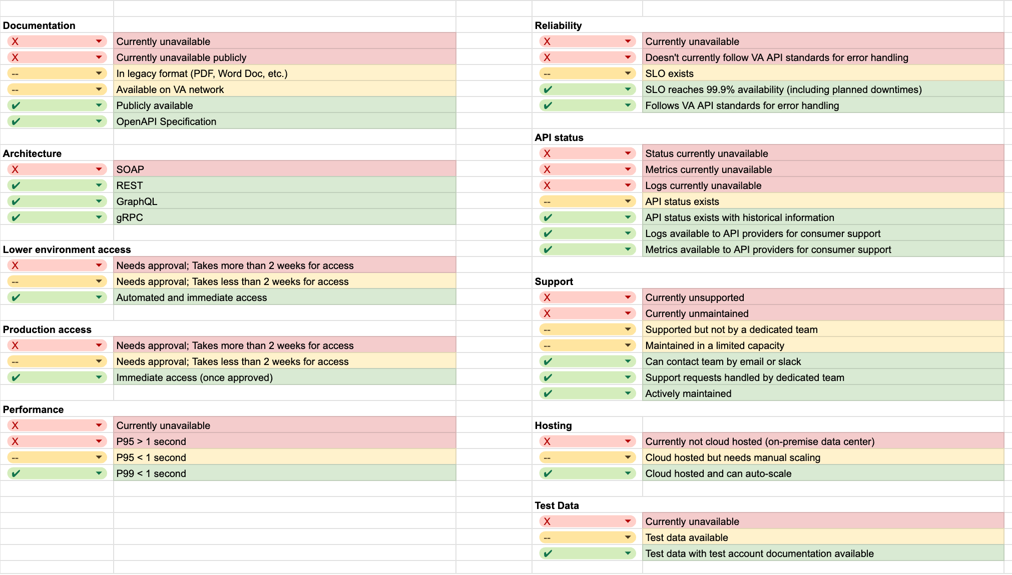
To address this, I proposed a simple, yet effective solution, a maturity model that highlights what is important to developers. These indicators should clearly identify core traits of an API such as documentation quality, test environment availablity, and support quality. To avoid a model that could be percieved as ranking or scoring the APIs, I focused on a binary system to offer quick and actionable insights without assigning judgement. This model would not only help developers make informed decisions but also encourage API providers to improve their offerings.
The Maturity Markers:
User Feedback
To validate the decision to utilize a binary indication marker, I conducted a series of user interviews and usability tests with developers from various backgrounds. I presented them with the proposed maturity model and gathered feedback on its clarity, usability, and overall effectiveness.
In these sessions, I needed to understand what is important to the developers.
- Do the maturity markers I narrowed down to, make sense?
- What do the visual indicators say to you when you see them?
- In other words, I wanted to understand what message the indicators provided the developers, and if it matches to my goals of the design.
- When looking for an API, what matters most to you? What says "this is a good API to work with"?
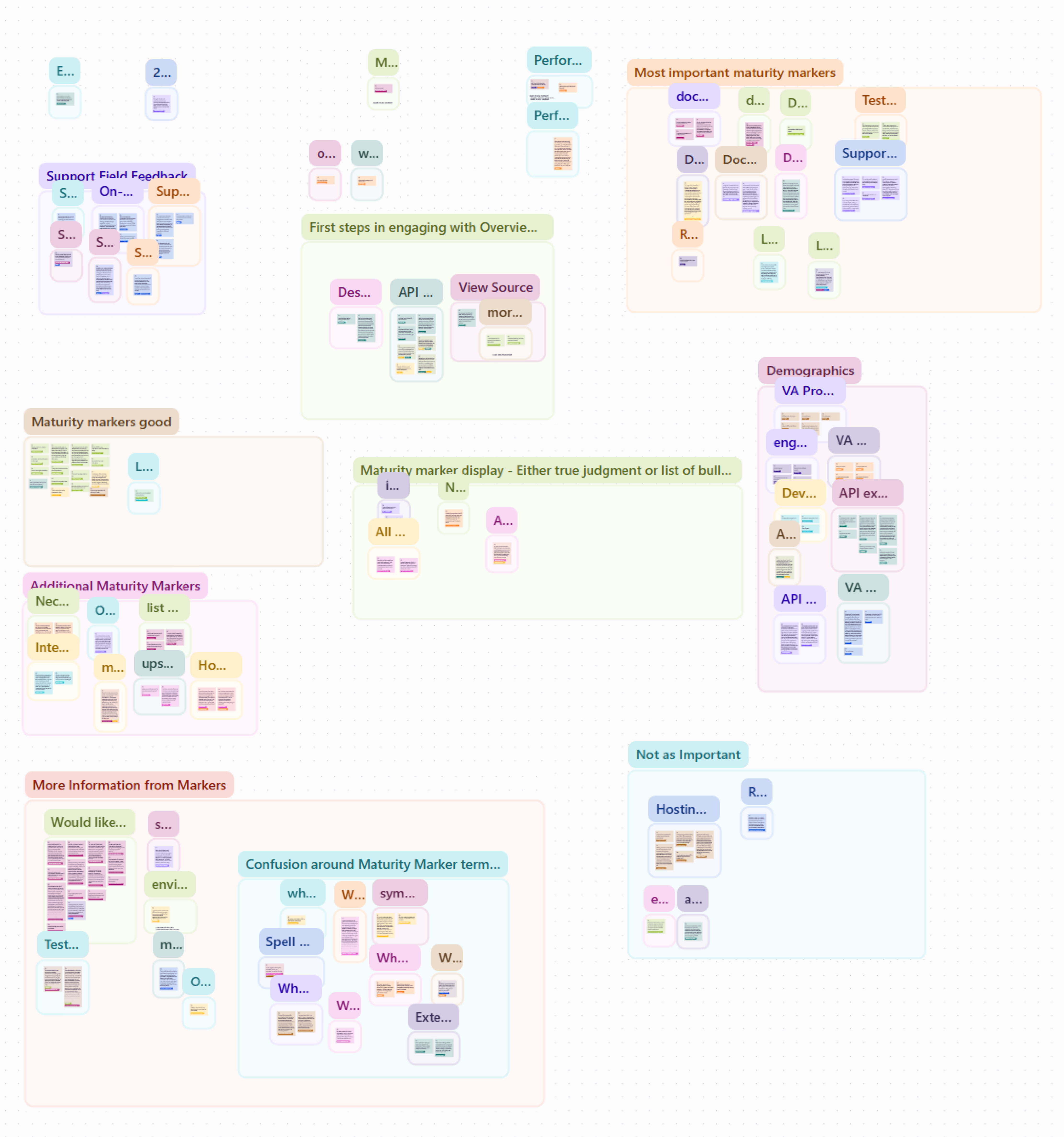
I was excited to hit the drawing board and consolidate my notes and do some Affinity Mapping by grouping my notes into valuable clusters of common themes.
Once I was finished with this, I was happy to say "I am on the right track!".
So, what were the Key Findings?
- Maturity Markers increased trust
- Even for lower-quality APIs, developers appreciated knowing what to expect.
- Documentation, support, and test data were the top priority.
- Developers found that the green checks portrayed "trust".
- Although, certain markers such as "performance" seemed to be misinterpreted with the green check mark.
- The hosting environment didn't matter to the developers I spoke with.
- What developers really wanted was more links to actionable content, such as "See sample data", or "Ask Support".
Reflections
The Biggest Lesson?
The biggest lesson that I took away from this project was that developers value straightforward and honest indicators to make their decisions confidently. Unlike the average user, developers don't need hand-holding or be guided through the process. They want to know what is available, and how to use it.
The Hardest Part?
Balancing simplicity with nuance. This ask was to take a complex list of important API details and simply translate it to developers.
It became clear early on, that avoiding any negative connotation on an API was important, but also critical for developers to know what each API can provide them.
The Best Part?
The maturity model respects everyone in the system. It made choices easier for developers who use the portal, but also provided a gentle push for API teams to improve thier offerings. Overall, this provided a strategic UX where confusing and technical once existed.
Design Systems
Summary: I helped create a unified design system for Accruent, merging different product UIs into one cohesive library. I built the entire component library using HTML, CSS, and JavaScript, learning as I went, and worked closely with developers to make sure everything was smoothly adopted across the company’s products.
Operation: Design System Engineer
For the longest time, Accruent was in the business of acquisitions. To increase their offerings, the company would always buy smaller companies and integrate them into the portfolio.
From a business perspective, that sounds great, but from a designers perspective, this sounds like a challenge.
Each new product came with its own unique flavor of UI: custom colors, fonts, icons, form fields, login flows, design quirks, and everything else great about a product!
So, as time went by, the company gathered a collection of 10+ uniquely styled products. Solution? Company leadership initiated a full design unification effort, and the UX team was asked to build a design system that could bring order to the chaos.
The 'UX' Breakfast Club
Ten different products, each with their own style, structure, and attitude, all under the Accruent umbrella. From telecom, lease accounting, energy management, and everything in between, and the UX team was tasked with building a design system that would make them work together.
Why a design system?
Well, why not! We needed to find a way to bring these products together in a scalable system that allowed them to be unique in their own ways, but similar in use and feel.
- The system needs to bring consistency to the visual and interactions across the products.
- Improve development speed and reduce wasted time on front-end UI components.
- Enable accessibility by design.
- Provide a common language for developers, UX designers, and product leadership.
What was my Role?
Up until this project, I spent my time working as a UX Designer on various projects and initiatives. Like the rest of my team, my job was to bring back a full audit of every component within the products I was responsible for.
If that's all you did, why does this project get it's own page?
Great question!
During the months leading up to this project, I had expressed an interest in learning more front-end development to improve the way I can communicate with my development teams. I didn't have much experience in web development, outside of a few freeCodeCamp lessons and tutorials.
Well, the stars aligned in the companies favor and instead of dedicating an entire development team, they had a UX Designer looking to learn more about front-end technologies!
After a long discussion, I had become the proud owner of an entire development project: to digitize the design library, including writing the HTML, CSS, and Javascript for every UI component we defined, from scratch!
Design Foundation & Transition
As a team, we started building our components in Sketch by conducting full asset audits for every product (icons, form fields, buttons, headers, login screens, common workflows, etc.)
Once these were collected, we were able to identify, compare, and sort UI elements into shared patterns that could provide us with a good starting point.
Code Component Library
Now, onto the major role I played in this project!
Design to Code
The first step was to digitize every component we defined in the design library into code that developers could use out of the box. For each component, I wrote clean, modular HTML, Pug, SCSS, and vanilla JavaScript, ensuring everything was fully documented and copy-paste ready.
Can't forget about accessibility! Accessibility was non-negotiable. Every component adhered to WCAG guidelines, using semantic HTML, ARIA attributes, proper contrast ratios, and full keyboard navigation to ensure inclusivity by default.
Modular Structures
I structured the component library with a clear, modular folder architecture, organizing files by component type. SCSS variables and mixins handled system-wide consistency in color, spacing, and typography. This modularity wasn’t just for organization, but it made the library scalable, maintainable, and perfect for white-labeling.
Each color was defined as both a variable and a class, enabling products to customize their own palettes without altering the components themselves. For instance, while our design governance recommended primary buttons use blue-400, the structure allowed for easy overrides, granting flexibility without sacrificing consistency.
Inspired by Bootstrap’s flexibility, I built a custom set of utility classes and layout helpers, enabling developers to create responsive layouts and adjust spacing with ease, without relying on a bulky UI framework.
Framework-Free by Design
I deliberately chose to use vanilla JavaScript for all interactivity. This ensured the library stayed lightweight and framework-agnostic, giving development teams the freedom to integrate components into whichever tech stack they preferred.
Optimize the Development Workflow
To streamline development, I built an automated workflow using Gulp, PostCSS, and BrowserSync. This setup handled everything from compiling and minifying code to prefixing and live reloading. This made iterations fast and frictionless.
Governance
Every component was version-controlled and tagged to support gradual rollout and safe updates. Governance and documentation were provided alongside each component to guide correct usage, color standards, accessibility practices, and more.
Deployment and Distribution
To support consistency across multiple products, we hosted the main CSS file on Azure. Teams could simply import this file into their projects, immediately gaining access to the full component set, with updates rolling out centrally whenever the core library was improved.
I used NPM for dependency management, Git for source control, and Azure DevOps for CI/CD pipelines and cross-team collaboration. This setup ensured the component library could evolve alongside our products without disruption.

HTML, SCSS, and Pug

Vanilla Javascript

Gulp, PostCSS, and BrowserSync

Bootstrap-Inspired

Versioning System

WCAG 2.1 Compliance

Azure DevOps
Showtime!
Once I finished the last component in the library, it was time to figure out how to roll it out.
One lucky development team was selected to be the pilot team on my new library. To make sure things went smoothly, I spent this time working closely with the development team as they walked through the implementation of the component library.
To be completely honest, this part of the project was when I became the most anxious. The moment of truth. Did the way I build this component library make sense? This was my first time working with development tools, writing the code myself, and putting it all together to hand off to the "real" developers.
Success!
The pilot turned out to be successful. Now, I don't want to imply that it was without some updating, but these were minimal and took me less than an hour to fix. I want to say there was only 2-3 little things that required a quick update, but everything else was smooth. The system worked as it should, the CDN was pulled in properly, and my components looked perfect in translation to the production pages.
Results?
The impact of the component library was felt across the entire product suite. It brought visual consistency to the brand by unifying the UI language across all tools, creating a cohesive experience for both users and developers.
With a scalable, reusable codebase, teams could plug accessible components into any modern front-end framework with minimal effort.
This not only saved development time, by speeding up UI builds and reducing redundancy, but also improved the user experience, allowing customers to move seamlessly between products without disjointed interfaces.
The system gained lasting adoption, rolling out successfully across most of the portfolio (excluding a few legacy applications), and continues to be in use and maintained today.
Reflections of a First-Time Developer
What was the hardest part?
Good question! Honestly, and suprisingly, it was not the code and learning development best practices (thanks to Google, StackOverflow, and a LOT of trial/error). The most difficult part about this project was my own self-doubt.
There were moments during the project when I really started to question myself. I found myself wondering if I was even cut out for this kind of work. I’m not a developer. What if I made a huge mistake? At times, it felt like I was in over my head, that I had taken on more than I could handle, or even worse, what if I had let my team down.
What was the best part?
Finishing the project.
Being able to say that I went from an empty document in my text editor, to over a hundred files in the folder, each properly written in languages I didn't understand prior.
But mostly the proof that I can make things happen. I took a request, with no knowledge or experience, learned everything I could to complete the project, and made it happen. Not bad for a first project, I guess I thought making the computer say "Hello World" was too boring!
Oh, and just an extra flex, I did everything before the rise of ChatGPT. All, 100% hand-coded, yeah!!
Accessibility
Summary: I took charge of building an in-house accessibility program at Accruent, even though I was new to the topic, after a lawsuit sparked urgency. In just two years, I created training, audits, and processes that got the company on track, improved accessibility, and earned praise from users with disabilities.
Building an Accessibility Program from the Ground Up
When Accruent was in the process of acquiring another company, a significant challenge emerged, a looming accessibility lawsuit against the company we were purchasing. This raised both fear and urgency, as leadership realized they had to address digital accessibility issues.
At the time, accessibility was a completely new concept for the company, and there was no existing infrastructure or strategy in place to manage it.
The Secret Weapon
It's me, I'm the secret weapon!
I was tasked with leading this initiative. Admittedly, I had no prior experience in digital accessibility, but I was chosen for my ability to quickly learn new topics and provide actionable insights. The UX team was asked to identify and propose a solution that would address accessibility concerns, and I was appointed to lead this charge. With the acquisition process underway and a pressing need to act, I was eager to jump into a new challenge.
What was my role?
As the sole resource on the project, I took on the responsibility of designing and implementing an accessibility strategy for the entire company.
For the first year, I was solely responsible for driving the initiative, with executive and stakeholder support but no established framework for success. My job was to research accessibility solutions, propose a clear direction, and convince leadership on the best path forward.
Ultimately, I needed to present multiple options and make a recommendation on how to move forward. This meant that I was tasked not only with understanding the technical and legal aspects of accessibility but also with navigating the complexities of company culture and executive priorities.
Strategy and Execution (the fun part!)
Exploring Solutions
My first task was to understand the landscape of accessibility solutions. I identified three distinct paths the company could take:
-
Outsource to a third-party that specialized in accessibility.
- Pros: Less work for me, no need to spend time learning accessibility. (Boring)
- Cons: Costly, doesn't solve the need for an accessibility-first culture.
-
Create an in-house team to handle accessibility.
- Pros: In-house means more control, can help provide the 'proof' for internal stakeholder support.
- Cons: Staff would need to be trained and pulled away from other projects.
-
Purchase an accessibility overlay tool to sit on top of our software to handle
accessibility issues.
- Pros: Fastest option, not much time and resources to get it working.
- Cons: Doesn't actually solve the problem. Just slaps a sticker on and calls it new.
After thorough research and meetings with a few third-party vendors, I realized that using an overlay was more of a temporary band-aid rather than a long-term solution. While it could be helpful in addressing some issues, it wouldn’t build the culture or infrastructure needed for sustainable accessibility.
After presenting my options and recommending that we move forward with an in-house team, leadership agreed and asked me to spearhead the initiative. So I quickly got to work on a mind map, to outline all the resources, people, and processes we would need to consider.
Building the Accessibility Program
Prior to this project, I was not familiar with web accessibility, or anything in relation to it.
I quickly realized I would need to become the subject matter expert (SME) in accessibility, so I dove headfirst into learning everything I could. I took online courses on Digital Accessibility, familiarized myself with the WCAG (Web Content Accessibility Guidelines), and ultimately earned my Trusted Tester Certification through the Department of Homeland Security.
To reinforce my learning, I created a comprehensive presentation for my fellow UX designers. The goal was to help them understand the WCAG criteria and the importance of building accessibility into our design process from the start. The session was a hit, and it helped lay the foundation for a company-wide accessibility initiative.
Implementing Change
To make accessibility a priority in the company, I worked with various teams to implement some important changes to the way we worked.
Auditing the Products (VPAT/ACRs)
First, I needed to conduct accessibility audits for all of the products, documenting issues by severity and type. During this process, I kept notes and created governance documentation so the process could be improved and repeated.
Workflows
I worked closely with development teams to integrate accessibility into our workflows. This involved creating Jira tickets for each violation, assigning priority levels, and working with QA engineers to ensure that accessibility was considered part of the definition of “done” for every user story.
This eventually led to the creation of an accessibility dashboard to track the progress towards compliance for each product in the portfolio. This tool helped us measure how many issues were found in each product, their severity, and how many had been resolved.
Additionally, I worked with a few other teams to improve their workflows as well. I collaborated with the Tech Writing team to ensure that multimedia assets met accessibility standards. I worked with the DevOps team to add axe-core to our CI/CD Pipeline, to help developers avoid making accessibility mistakes. Finally, I updated the design system to have accessibility built-in.
Training
One of the most important aspects of the program was ensuring that accessibility became ingrained in the company’s culture. I developed training materials, including slides, tutorials, and cheat sheets, to guide our teams. I also created interactive workshops, which I called “accessibility scavenger hunts,” to make learning fun while reinforcing key concepts.
I presented these workshops across the company, at the crew, product, and function levels. By the second year, the training program was being used to onboard new UX designers, ensuring that accessibility was a top priority for everyone joining the team.
Impact on the Company
Over the course of the first two years, the accessibility program gained momentum. By the end of year one, the overall compliance levels had significantly improved. The feedback we received from customers, particularly those with disabilities, confirmed that our efforts were making a tangible difference. One customer even told us that our application was among the most accessible they had worked with in their field, which was a huge win.
By year two, most of the accessibility issues had been resolved, and where they hadn’t, we had identified workarounds and kept those issues on the roadmap for future resolution. I transitioned back to my regular UX design work while continuing to manage the accessibility program from a supervisory role. My work as an SME ensured that accessibility remained a priority across the company.
The training I developed was still in use long after I had moved on from the project, and I remain in contact with several team members who continue to champion accessibility in their daily work.
Self-Reflections
The most challenging aspect of this project was the amount of responsibility that landed on my shoulders in such a short time. One day I was just a UX designer, and the next, I was tasked with building an accessibility program from scratch. The pressure was immense, but I thrived in the challenge.
Looking back, I’m incredibly proud of what I accomplished. I started with no knowledge of digital accessibility and ended up creating a program that was adopted across the company and is still being used today. That success didn’t happen overnight—it was the result of constant learning, persistence, and a willingness to adapt.
I learned that accessibility isn’t just about checking boxes. Embedding accessibility into Agile and DevOps workflows requires more than just tools and guidelines; it requires empathy, education, and consistent reinforcement.
Data Analytics
Summary: I led the creation of Accruent's first-ever data visualization platform, designing 10 customized dashboards to help users track operational efficiency, reduce costs, and combine data across multiple products. Despite working without data for most of the project, I self-taught data visualization principles, conducted user research, and built realistic mock datasets, ultimately delivering dashboards that have been widely adopted and are still in use today.
Designing Insights: Analytics Dashboards
This project began with a clear focus on enhancing the experience for facilities management and capital planning users. Our target users were primarily administrators, business analysts, and other financial professionals. At the time, we didn’t have a dashboard or any data visualization tools to offer. The company had collected a substantial amount of valuable data from customers using our applications, and the decision was made to create a platform that would allow these users to access and utilize their data for their own purposes.
This marked the beginning of a brand-new feature for the company. The data engineering team chose IBM Cognos as the platform to power the new functionality, and it was clear that this would be a transformative project.
So I was brought in to lead UX for the company’s first-ever data visualization and analytics platform. My challenge? Make enterprise-scale data clear, intuitive, and actionable for a diverse set of users across finance, operations, and planning.
Data, Data, Data
Given the nature of this project, it required a deep dive into data and data visualizations. I was determined to deliver a thoughtful, user-centered design, so I invested in courses on Udemy to learn about the psychology behind data visualizations, as well as specific courses to become an expert in IBM Cognos. This self-study helped me understand the platform, the science of data presentation, and how to design visuals that communicate insights effectively.
To ensure the designs I created were grounded in user needs, I conducted interviews with some of our largest customers. I focused on understanding their challenges with data, what they hoped to accomplish with a new platform, and what an ideal solution would look like. I also attended one of the company’s largest sales conferences, where I had the opportunity to interact with senior decision-makers and seasoned sales representatives who had built lasting relationships with customers over the years. Their insights proved invaluable in guiding my design decisions.

Managing Real Estate Portfolios

Tracking Performance

Reduce Costs and Risk
"How can I manage assets smarter and more efficiently?"
Understanding the User
What stood out from my conversations with customers was a common theme: they wanted to understand if they were using their financial assets efficiently and how they could proactively reduce unnecessary costs. Importantly, many customers used multiple products within the Accruent portfolio, and this would be the first time they could combine data from different sources into a single, unified view.
The design challenge was clear: I needed to create dashboards that not only made it easy for users to explore and interact with their data but also helped them derive meaningful insights from it.
Where is the Data?!
The goal was to provide various access levels to the platform: from power users with full customization options to view-only users who could access predefined dashboards and reports. My biggest challenge was understanding how to present complex data in a way that told a cohesive and understandable story. I needed to decide which metrics were most important and how to visualize them in a way that resonated with different user personas.
A significant challenge during this process was that the development and data teams were working on the backend connections between the data and IBM Cognos, and I didn’t have actual data to work with. To bridge this gap, I decided to create my own dataset. I generated random data for five states, cities, and buildings, with random square footage and lease data, and then created a large dataset with over 100,000 rows and 30+ columns. This allowed me to simulate real-world scenarios and begin developing dashboards based on the data I had created.
The Final Delivery
These dashboards became a key feature for many of our customers, offering them insights into various aspects of their operations. During a conference, I had the opportunity to present these dashboards to a group of 30-40 attendees. The reaction was overwhelmingly positive, with many expressing excitement about the upcoming availability of the platform.
I ultimately created 10 standardized dashboards, each designed for a specific goal or user role. They included themes like:
- Operational Efficiency
- Lease Cost and Forecast Reports
- Cross-Product Asset Utilization Dashboards
- Portfolio Health Metrics
Each dashboard was crafted with a blend of visual storytelling and data integrity, allowing the customer to choose the right chart for the right question, and keeping cognitive load low.
However, due to some backend issues, customers weren’t able to access the dashboards immediately. It took a few months before they could use them, but once the platform was live, it became evident that the dashboards were being frequently accessed by both large and small companies. This was a clear indication that the solution I had designed was meeting the needs of our users.
Reflection on the Data
This project taught me the critical role that data visualizations play in storytelling. It became evident that a simple table of numbers wouldn’t have the same impact as a well-designed chart or graph. Even more, the way data is visualized can drastically change the story it tells. Two different visualizations using the same data can lead to completely different interpretations. I had to be deliberate in choosing how to convey the importance of the data and the message it was intended to communicate.
One of my key takeaways was understanding how critical it is to get into the details of the users’ needs. I spent a significant amount of time learning about the different personas and industries we were designing for. By identifying their unique needs and goals, I was able to create a tailored experience that resonated with each user group.
Ultimately, the most rewarding part of this project was seeing how much people appreciated the final product. The time I spent learning about data visualization and the psychology behind it paid off, and knowing that my work is being actively used by many of our customers today is incredibly fulfilling.
End-to-End Design
Summary: Siterra Site Navigator is a SaaS tool that streamlines the telecom site selection process, replacing inefficient manual methods and reducing operational costs, ultimately boosting customer satisfaction and revenue. The design process involved close collaboration with stakeholders and a focus on user needs, overcoming challenges like team changes and technical integration to deliver a product that significantly improved efficiency and visibility.
Customer Vision to Production-Ready
This project focused on building a brand-new application called Siterra: Site Navigator.
Siterra Site Navigator is a SaaS product designed for enterprise companies, particularly in the telecom industry, to streamline the site selection process. It offers a comprehensive toolset for managing a large portfolio of locations and assets, allowing telecom tower companies, mobile network operators, and service providers to market their available sites, manage incoming requests, and improve the overall selection process. By integrating directly with Siterra’s data and project management functionality, Site Navigator ensures consistency, traceability, and efficiency throughout the site selection process.
Problems to Solve
Before Site Navigator, there was no standard solution for marketing telecom sites, leaving many companies reliant on manual processes such as emails, spreadsheets, and photos. As a result, communication was inefficient, often leading to lost requests, long wait times, and missed revenue opportunities. In addition, there were no standardized processes to manage these requests, and tracking service level agreements (SLAs) was a challenge. This unstructured approach often resulted in delays and inefficiencies for customers, creating frustration and operational bottlenecks.
Step One: Discovery
Through discussions with clients, we discovered that there was a critical need for a more streamlined, centralized tool. Network operators and tower companies frequently faced the challenge of managing thousands of sales requests per year, often manually, which was both time-consuming and costly. Furthermore, the lack of visibility into the status of requests was a significant pain point.
The goal was to develop a tool that would enable users to visually search for and engage with potential sites, significantly reducing manual work and increasing the speed and accuracy of the site selection process. The outcome of Site Navigator was expected to bring in millions of dollars in additional revenue by improving operational efficiency and customer satisfaction.
Step Two: Designing It!
The design process began with conversations with key stakeholders, including customers and the product manager, to understand the core requirements. Once we had clarity on the goals, I worked closely with the product manager to create wireframes and mockups to visualize the user journey. The goal was to design a simple, user-friendly interface that would allow customers to search for sites easily, review detailed data, and submit requests for engagement.
While many aspects of the design were agreed upon early in the process, there were still minor changes and iterations as the project progressed. For example, discussions around the positioning of buttons, tools, and functionalities were frequent as we refined the user experience. We also had to pay careful attention to the functionality of the map and grid views, ensuring that the integration with Siterra’s backend systems was seamless.
Project Finances and Timelines
Site Navigator took approximately 9 months to develop from concept to MVP release. The total estimated cost of the project was between $500K and $1M, including development, product management, UX work, and licensing costs (such as the Google Maps component).
Despite the challenges, the final product significantly reduced operational costs for customers, simplifying the sales and request processes. This led to improved customer satisfaction, as it eliminated manual steps and provided better visibility into the request process, which in turn contributed to increased revenue opportunities.
What the Tech?!
Site Navigator was built using React and REST technologies, both of which had proven success within the company. One of the key challenges was integrating modern technologies with a legacy database, but overall, the engineering team was able to navigate these obstacles without major issues. The team appreciated the flexibility and opportunity to innovate, as Site Navigator represented a new feature offering for the company, allowing us to explore new ways of delivering value to our customers.
Conclusion
The development of Site Navigator was a collaborative and iterative process that involved overcoming several challenges, including changes in team composition and evolving customer requirements. Despite these hurdles, the final product delivered significant value to both Siterra and its customers, streamlining the site selection process, improving operational efficiency, and enabling millions of dollars in potential revenue growth.
Through this project, I learned the importance of early stakeholder engagement, maintaining flexibility in design, and continuously iterating based on user feedback to achieve a solution that truly meets the needs of the users and the business.
Rugged TCG
Summary: Rugged TCG is a multiverse-themed digital trading card game that combines strategic gameplay with blockchain-powered NFT integration. Players bring their own NFTs as playable cards, building 30-card decks to battle for control of dynamic locations, using a unique Time-on-Field mechanic for balanced play. Built on the Solana blockchain, it offers low fees, fast transactions, and true ownership of NFTs, which can be customized and traded. The game emphasizes fair play, community-driven development, and a sustainable economic model tied to a native token, providing an exciting and competitive experience for both players and collectors.
The Vision
Rugged TCG is a digital card game that places emphasis on strategic depth and skill, but also providing players with control over their cards in ways that traditional TCGs have not provided their players.
Thanks to blockchain technology, players are provided a unique platform to customization and ownership of thier digital assets.
- Strategy not Investment
- Success is determined by player decisions, not financial investments or luck.
- Customization
- NFT integration allows players to showcase thier collections while maintaining fair gameplay.
- Engagement
- A multiverse setting where players can influence battles across dynamic locations.
Market Opportunity
Digital trading card games have seen rapid growth but often suffer from limitations such as lack of customization, pay-to-win mechanics, and limited tradeable assets.
The introduction of NFTs in gaming has created a new era of player-owned assets, but few games have successfully integrated NFTs into the gameplay experience in a meaningful way. Rugged TCG aims to fill this gap by providing true ownership of in-game assets with real utility.
- Limited Customization in Digital TCGs
- By allowing players to bring in thier own NFTs, they are provided the opportunity to customize their cards to a style that suits them.
- Pay-to-Win Mechanics Dominate Many Competitive Games
- All cards have predefined stats and abilities, ensuring skill-based gameplay, not financially driven.
- NFTs can often lack meaningful utility beyond static ownership.
- Players will mint, own, trade, and use their already owned NFTs to customize their cards in a decentralized ecosysytem.
Game Design and Mechanics
Core Gameplay
The primary goal of Rugged TCG is to capture and control locations in the game's multiverse while eliminating opponents. Players will build decks of cards that represent characters, abilities, and items, and use them strategically to outmaneuver their opponents.
Each turn, players can play cards from their hand, move characters, and attack opponents. The game ends when one player has eliminated all of their opponent's characters or has captured a predetermined number of locations.
Key Mechanics
- Customization
- Players attach NFTs as artwork to card shells, adding a layer of personalization to the game.
- Minting
- Players can mint their own card packs, containing randomized elements like characters, equipment, and abilities, which are stored as NFTs on the Solana blockchain.
- Fair Play Philosophy
- The game ensures that customization is cosmetic, and gameplay balance is maintained by limiting the impact of NFTs on in-game stats and abilities.
NFT Integration
Goals
- Bring Your Own NFTs
- Players can link NFTs from their Solana wallets to customize their card artwork. This has no impact on gameplay but adds a significant layer of personalization.
- Minting Card Shells
- Players can mint packs of randomized cards as NFTs, which can either be opened in-game or traded on secondary markets.
- Blockchain Transparency
- Blockchain technology ensures transparency in the minting process, so players can verify rarity and fairness.
Milestones
- Phase 1: Intial Setup
- Define NFT metadata structure using Metaplex standards.
- Build Solana wallet connection functionality using Phantom Wallet.
- Design backend infrastructure for NFT attachment and pack minting.
- Phase 2: Customization Features
- Develop card shell customization workflows (UI and Backend).
- Implement automated NFT filtering and moderation tools.
- Test NFT detachement and swapping mechanics.
- Phase 3: Mintable Card Packs
- Design pack generation logic with rarity and randomness.
- Develop minting UI and Solana program integration.
- Set up trading functionality for unopened packs.
- Phase 4: Testing and Launch
- Conduct closed beta testing for NFT features.
- Monitor performance and address bugs.
- Launch to the public.
Custom Coin Development Plan
- Phase 1: Desing and Development
- Define tokenomics (total supply, distribution, utility, etc.)
- Use Solana CLI and SPL Token library to create the token.
- Deploy the token and mint intial supply.
- Phase 2: Integration
- Add custom coin support to the Rugged TCG platform.
- Enable purchases and pack minting using the coin.
- Link coin with the marketplace for trading.
- Phase 3: Smart Contract Deployment
- Develop and deploy contracts for managing fees and transactions.
- Ensure security through audits and testing.
- Phase 4: Launch and Monitoring
- Roll out the coin alongside NFT integrations.
- Monitor adoption and address any technical issues.
- Introduce rewards and promotions to boost coin usage.
Tokenomics Distribution
Total Supply: 500 Million
Many games on the Solana blockchain use a range of ~9000 to 36 billion tokens, relcting a variety of different economic models and game scopes. The idea behind the 500 million token supply is to maintain scarcity to support overall token value, stay competitive in the market, but still offer a large supply for gameplay and rewards.
- 40% - In-Game Transactions
- Facilitates purchases of card packs, minting fees, and marketplace activities.
- 30% - Player Rewards and Incentives
- Distributed through gameplay achievements, staking rewards, and community engagement.
- 20% - Developer and Team Reserves
- Allocated for development, operational expenses, and future expansions, subject to a vesting schedule to ensure long-term commitment.
- 10% - Liquidity and Partnerships
- Set aside for liquidity pools, strategic partnerships, and ecosystem growth initiatives.
Market Potential
Solana Blockchain Advantage
Solana’s blockchain provides low transaction fees and high-speed processing, which is crucial for real-time games like Rugged TCG.
Players can make transactions (such as minting packs or transferring NFTs) with negligible fees, improving the overall experience compared to more expensive blockchains like Ethereum.
The decentralized nature of Solana guarantees that the game and its assets remain secure, and players can trust the platform for asset ownership and trading.
Innovative NFT Use
Rugged TCG allows players to mint, own, and trade NFTs, giving them control over their in-game assets. This is a key differentiator from other digital card games where assets are stored centrally.
Unlike other card games, Rugged TCG lets players personalize the artwork on their cards through NFTs. This customization goes beyond aesthetic changes and allows for a unique identity within the game.
Competitive Advantage
Rugged TCG ensures that gameplay is not influenced by financial investment. All cards have predefined stats and abilities, and customization does not affect gameplay balance.
Unlike many traditional TCGs, Rugged TCG’s design promotes skill over financial power, creating a more level playing field.
With NFTs tied to player-owned assets, players have a direct stake in the success of the game. They can trade, sell, or showcase their NFTs, fostering a thriving, engaged community.
Revenue Model
Revenue Streams
- Minting Fees: Players will pay a fee to mint card packs as NFTs, generating a consistent revenue stream. This minting process will generate a continuous income as players purchase card packs.
- Customization Fees: A small fee will be charged for attaching or swapping NFTs on card shells.
- Marketplace Fees: A small transaction fee will be charged for trading NFTs (customized cards, unopened packs) in the marketplace. The secondary market will also open up a long-term source of revenue as trades occur.
- Premium Packs: Special packs with exclusive or limited-edition cards can be sold at a premium price.
Secondary Market
The secondary market will be a crucial revenue stream for the game, where players can buy and sell unopened packs, rare cards, and NFTs, generating ongoing value for both players and the platform.
Long-Term Goals
- Staking and Rewards
- Introduce a staking mechanism for a custom in-game currency, rewarding long-term players.
- Governance
- Allow players to vote on future updates and expansions, fostering a decentralized, community-driven ecosystem.
- Cross-Platform Play
- Expand Rugged TCG to other platforms, making the game accessible to a larger audience and further cementing its place in the competitive gaming space